Mount Sinabung eruption as seen by Sentinel-5P
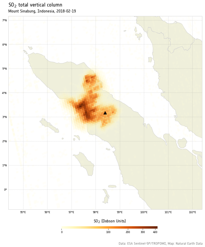
On February 19, 2018, Indonesia’s Mount Sinabug, a stratovolcano on the island of Sumatra, erupted violently, spewing ash at least 5 to 7 kilometers into the air over Indonesia.
The erupting lava dome obliterated a chunk of the peak as it erupted. Plumes of hot gas and ash rode down the volcano’s summit and spread out in a 5-kilometer diameter, coating surrounding villages in ash.
In this post, we are going to see how this event has been recorded by the TROPOMI instrument on board of ESA‘s Sentinel-5P earth observation satellite, using Python, xarray, and cartopy
Environment configuration
Let’s import out libraries
1 | import numpy as np |
Let’s give our plot a bit more of a ESA look by using the ESA font:
1 | # define font family for plots |
Define plot extent
We are going to define our plot extent as square centered around the volcano.
1 | Point = namedtuple('Point', 'lon lat') |
Plot extent: lon(94.393, 102.393), lat(-0.831, 7.1690000000000005)
Reading the data
My sample products are usually stored in a structured directory tree. The following line of code recursively looks for all files matching a given filename pattern starting from a root directory.
1 | input_files_dir = "/Users/stefano/src/s5p/products/SO2_Sinabung/" |
#0 Orbit: 01814, Sensing Start: 20180218T054902, Sensing Stop: 20180218T073033
#1 Orbit: 01828, Sensing Start: 20180219T053006, Sensing Stop: 20180219T071137
#2 Orbit: 01842, Sensing Start: 20180220T051110, Sensing Stop: 20180220T065240
#3 Orbit: 01843, Sensing Start: 20180220T065240, Sensing Stop: 20180220T083411
#4 Orbit: 01857, Sensing Start: 20180221T063344, Sensing Stop: 20180221T081515
#5 Orbit: 01871, Sensing Start: 20180222T061448, Sensing Stop: 20180222T075618
#6 Orbit: 01885, Sensing Start: 20180223T055552, Sensing Stop: 20180223T073722
Product #1 seems to be covering the day of the eruption. Let’s open it with xarray. I know in advance that the variable of interest (SO2 total vertical column) is stored in the PRODUCT group, so all we have to do is:
1 | so2tc = xr.open_dataset(input_files[1], group='/PRODUCT')['sulfurdioxide_total_vertical_column'] |
<xarray.DataArray 'sulfurdioxide_total_vertical_column' (time: 1, scanline: 3245, ground_pixel: 450)>
[1460250 values with dtype=float32]
Coordinates:
  * scanline      (scanline) float64 1.0 2.0 3.0 4.0 5.0 6.0 7.0 8.0 9.0 ...
  * ground_pixel  (ground_pixel) float64 1.0 2.0 3.0 4.0 5.0 6.0 7.0 8.0 9.0 ...
  * time          (time) datetime64[ns] 2018-02-19
    latitude      (time, scanline, ground_pixel) float32 ...
    longitude     (time, scanline, ground_pixel) float32 ...
Attributes:
    units:                                                 mol m-2
    standard_name:                                         atmosphere_mole_co...
    long_name:                                             total vertical col...
    multiplication_factor_to_convert_to_DU:                2241.15
    multiplication_factor_to_convert_to_molecules_percm2:  6.02214e+19
The advantage of storing our data into an xarray DataArray is being able to access xarray’s amazing indexing, filtering and masking capabilities, something that would require much more effort, should we limited to use the basic NetCDF4 libray instead.
Processing the data
We would like to subset our dataset around our point of interest. To do so, we are going to define a function that takes an xarray’s DataArray and latitude/longitude boundaries, and returns a crop of the input dataset. The function relies on the xarray’s filtering function where. Values outside the crop region will be discarded. We assume that both latitude and longitude are actual dimensions in our input dataset.
1 | def subset(so2tc, plot_extent): |
1 | so2tc = subset(so2tc, plot_extent) |
Next, we are going to set all negative values to 0, as well as converting the values to Dobson Units.
1 | # set all negative values to 0 |
Easy as pie!
Our dataset is now ready to be plotted.
Plotting the data
Let’s define a custom color map, with increasing alpha (transparency) level.
The idea is that lower values should be more transparent than higher values, following a square root law. Doing so, we prevent lower background values to show up in the plot, and at the same time we emphasize the impact of higher values.
1 | cm_values = np.linspace(0, 1, 16536) |
For sake of convenience, we can define a function that is going to take care of plotting the dataset. We are going to use cartopy’s ability to seamlessly add Natural Earth Data features to the plot. In this example, we are going to add state/province borders and land features.
I played a bit with adding Google map’s tiles to the plot background but the results were suboptimal. I raised an issue on cartopy’s github, which so far does not have any practical solution. That’s a bit of a shame and I strongly hope that a solution comes up soon.
Note that the actual SO2 total vertical column plot is performed by the pcolormesh function. The rest is basically bells and whistles. Worthy of mention is the use of a custom colormap normalization, to follow a square root law. In this way, we avoid the higher values to overwhelmingly saturate the plot.
1 | def plot_so2(so2tc): |
Let’s see it in action:
1 | plot_so2(so2tc) |
Look at that unprecedented resolution!
For comparison, have a look at the same scene as seen by NASA’s VIIRS instrument, and KNMI’s OMI on board of NASA’s Aura satellite.
Conclusion
In this post, we showed how to use xarray to easily open and filter NetCDF4 files, and how craft a publication ready plot with Matplotlib and cartopy.
I hope you enjoyed it, and feel free to comment if you have questions or remarks (especially if you managed to properly display Google map’s tiles in a cartopy plot!).
This post was written entirely in a Jupyter notebook. You can download it on my GitHub repository.